Anita Santiago

Healio Design System

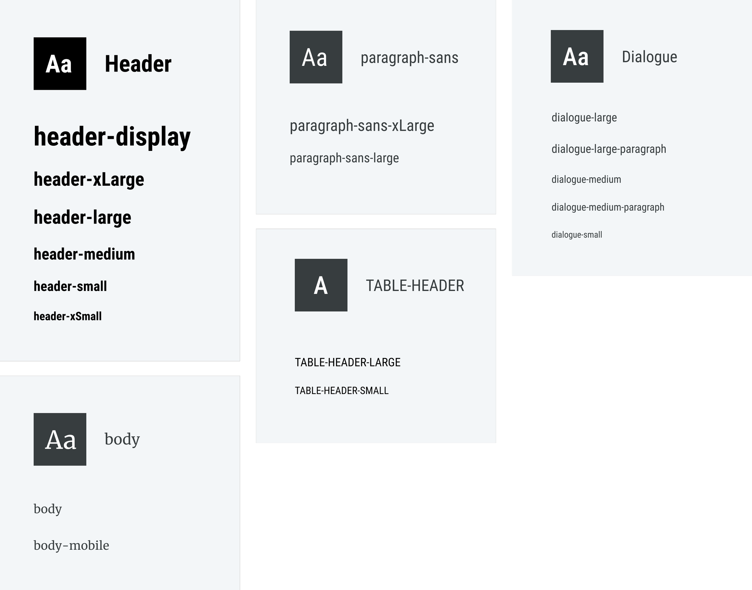
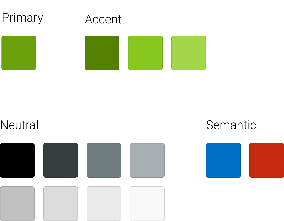
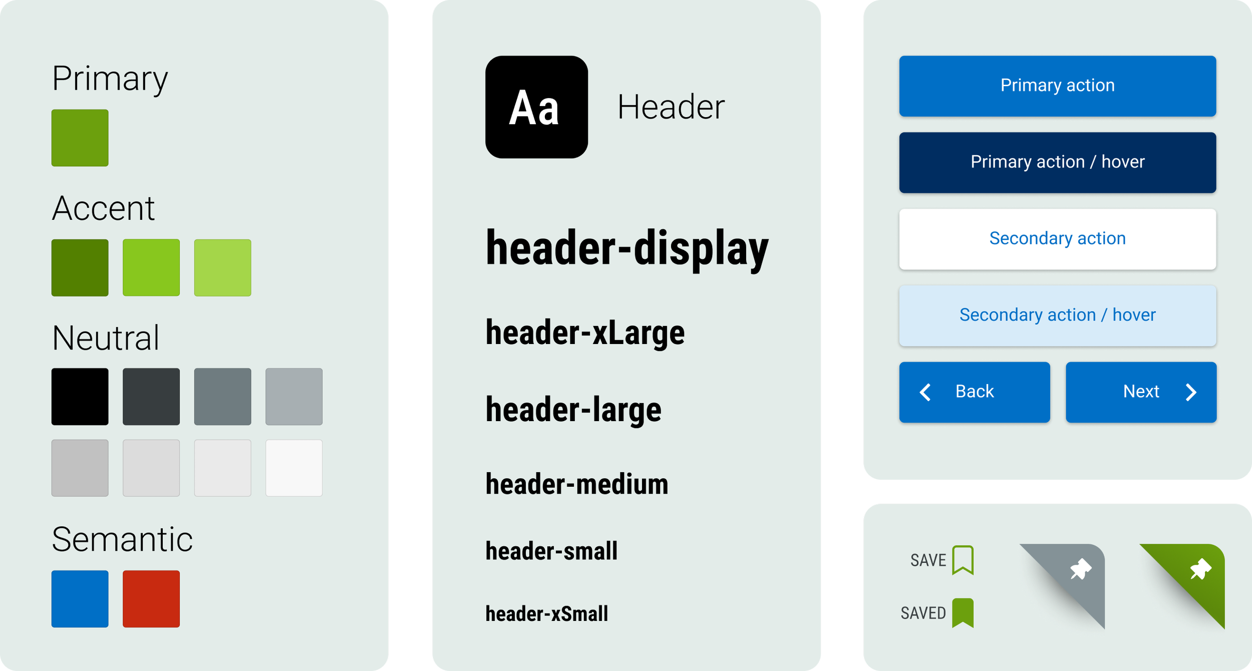
Without a design system in place, the visual aesthetics of Healio.com had been allowed to run wild, resulting in an inconsistent user interface and far-reaching adverse effects on both business outcomes and user experience.

A three-member cross-functional team, pulling from Product, Marketing, and Front-End Development, was tasked with researching, designing, and implementing a design system where none existed.

Timeframe:
On-going

My Role:
Lead User Interface Designer

The Team:
Anita: Lead UI Designer
Karen: Visual Designer
Al: Front-End Developer

Goals

  • Improve the user’s experience by developing a consistent user interface
  • Reduce technical debt and optimize cross-departmental collaboration
  • Improve site performance and page load speed by reducing code redundancy

373D3F.png

Research

Site audit

Front-End Development took the lead for the first research under taken by the team, a site audit and establishment of key performance benchmarks, including page load speed.

The site audit revealed 21 font families, 71 font sizes, too many unique icon and button styles to count, 107 unique font colors, and 142 unique background colors in use on the site.


Typography Guiding Principle: Typography exists to honor content


Typography Research

I collaborated with the visual designer on typography research, investigating best practices for font pairing, scaling, readability, load-time, and acceptability.

We established a guiding principle for the use of typography on the site. As the site’s primary goal is decemintation of serious academic medical content, we chose the guiding priciple “Typography exists to honor content”.


With our guiding principle defined, we made our typographical choices easily.

  • A serif font for the body copy to support the readability of long stretches of text

  • A condensed font for headers to accommodate titles which often lengthy medical terms

  • The font pairing of two Google Fonts, Roboto Condensed and Merriweather, for frequency of use in consideration of load time


Color Palette Research

I took the lead on color research, beginning by establishing guiding principles for the use of color on the site.

Color Guiding Principles:

  • Start with what you have. If your business has a memorable, established color, make it your starting point

  • For text-heavy sites, a white or neutral background assists in accessibility and readability

  • Eliminate competitors' colors when possible


Replacing the original brand color with a slightly darker color while retaining the spirit of the original Healio green was challenging.


The New Healio Green

I was tasked with chosing an updated brand color. Healio already had a memorable brand color, but, in application, when paired with white as a background or as foreground text, the resulting contrast ratio failed W3C requirements.

green_original.png

Original Healio Green

green_optimized.png

Optimized Healio Green

With the new Healio green chosen, color research was complete. Purple and brown were eliminated to distinguish Healio from competing sites in the Healthcare sector and the updated brand color was used as the basis for streamlined color palette, consisting of the primary brand color, a few accent colors, an array of neutrals.


Visual Design

Establishing consistent design principles

With the new fonts and color palette in hand, I collaborated with the visual designer to create a series of mood boards which we shared with key Healio stakeholders. Through a process of elimination and iteration, a visual design direction was agreed upon.

Prototyping

During prototyping, we established typographical and visual hierarchy principles. We then established consistent visual patterns for elements of the site like headers, navigation and filters, modals , buttons, links and form feilds, saving these patterns as components along the way. Finally, using prominent pages from the site, we established consistent page layouts.

Components

Page Layouts

F3F7F6.png

The Result

The design system has opened the doors to rapid product scalability, system-wide consistency, and better brand governance. Business impacts include decreased technical debt and faster page load times.

Pattern Library

During prototyping we built hundreds of complex, interactive components and added them to a growing library of components that can now be easily pulled from when building new products. The library includes all approved UI patterns, organized, categorized, named, and scaled according to the principles established in the design system. 


A System of Governance

With many departments pulling from and contributing to the design system and component library, it is crucial to have systems in place to keep the system lean and up-to-date and to avoid redundancy. I designed task flows with varying levels of authority for contributors to follow when interacting with the pattern library.


The future of the Design System

As best practices and accessibility standards evolve, so will the design system.

Since it’s adoption, the design system has grown beyond it’s initial scope to also include the corporate vision and guidelines for voice and tone. I recently collaborated with Front-End development to implement a series of accessibility updates to Healio’s color palette, form fields and buttons and regularly conduct post-launch inventories to harvest new components.